City of Glass is the highly praised comic adaptation of Paul Auster's "film-noir inflected" novel. It was adapted by Paul Karasik and David Mazzucchelli (famous for, among many things, his work on Batman: Year One), and is considered one of the "100 most important comics of the century." Having read another one of Auster's novels (Brooklyn Follies), I expected heavy and complex themes, but when paired with remarkable artwork just as meaningful as the text itself, the novel is taken to a whole other level! I can understand why City of Glass is so highly praised, but to be honest, I'm still trying to truly understand everything in the comic! I loved everything about this comic - the story, the art, the themes - and will definitely be reading the New York Trilogy as soon as I can. In an effort to understand more about City of Glass, I did some research online and found that there are plenty of papers about the novel (and therefore to an extent the comic) to keep one occupied for weeks. There were two analyzations of the title that I found particularly interesting. The first described City of Glass as alluding to the sheet of glass that is a "modernist skyscraper," minimalism at its best. The other explanation (from a paper written by William G. Little) echoes the ideas that the elder Peter Stillman believes, that New York is a scene of "cultural decay," a plethora of shattered people and things, and therefore a "city of glass." The cover features one of the most interesting panels from the entire comic. Quinn stands waiting for the train carrying the elder Stillman to arrive, and his face seems to be repeated over and over. A simple character drawing is to the right of him, and pops up often throughout the book. The type and color scheme are fairly simple, and written within one central column. I thought the back cover was also very interesting, as it seemed to be divided into panels, and displayed Quinn (the protagonist) walking across them. The narrative jumps from panel to panel.
The artwork of Mazzucchelli adds another dimension to the story, and is able to portray emotion and mood very effectively despite often being highly abstract. A good example of this, and also one of my favorite scenes, was the "speech" given by the young Peter Stillman. A tic-tac-toe game, an inkwell and an acoustic guitar are only a few of the things from which Peter's word balloons come from. I thought this worked very well considering the Peter's mysterious nature and use of words that did not make sense. In some way, it really added to his character by making him seem even more removed from reality. There are so many more panels that I could talk about, because each was unique. Another set I enjoyed were the ones spelling out "tower of babel" in Quinn's notebook. I also really liked the full page panel with the detailed realistic map of New York, featuring Quinn walking on top of it. I think Mazzucchelli really captured the essence of Auster's work in his depiction, in fact, I think he even managed to elevate it!
Quinn is the character that I felt I got to know the most about, and felt so much sympathy for. You can't help but feel his loneliness radiate off of the page. I also found the elder Peter Stillman fascinating, though not much is told about him beyond his visions and what he had done to his son. It left me wondering what his ultimate goal was before he killed himself. I enjoyed the character of Paul Auster as well, especially because it made the book seem even more like a metafiction. He played a more prominent role that I thought he would. But who is the overall narrarator? That is what really got me in the end!
I only just read City of Glass today, but I feel like I should read it again...and again.
Tuesday, November 18, 2008
Tuesday, November 11, 2008
Serenity
Serenity: Those Left Behind, is a graphic novel addition to Joss Whedon's acclaimed movie Serenity, which picks up after the ending of his cult-hit tv series Firefly. The story takes place after Firefly and before Serenity. Being a huge science fiction fan (especially of the "space western" variety), I have been meaning to rent both Firefly and Serenity. I had no idea there was a graphic novel as well, so I was very excited to hear about it in class. It was interesting to have this comic be my first experience with Serenity/Firefly because of it's placement within the storyline. The prologue was certainly helpful, and I think the both Whedon and Matthews did a good job in ensuring that even someone who had never seen Firefly could infer character relationships and the general situation of the group. I'm hooked, needless to say, I've put Firefly on top of my netflix queue!
The cover features two of the characters: Mal, the captain of Serenity and the central figure in the series, and Inara, who's backstory and significance isn't explained within the story. Serenity looms eerily behind them, and they are bathed in blue, foggy light. There are also fireflies flying amongst them, which is significant because their ship, Serenity, is a "firefly" ship (named so because of its design). The comic (and movie) are named after their ship, which is named after The Battle of Serenity Valley, the final battle of the Unification War (in which most of the characters fought on the losing side). Mal looks off to the side with his hands clenched, and Inara stares forward. Both look serious. What struck me most about the design of this comic was its very life-like design. All the characters are drawn to look extremely similar to their television/movie counterparts. This must have been nice for fans of the series, as it probably made it easier to relate the comic to the greater whole. It is always interesting to see how the artwork is done when a life-action movie or tv series is developed into a comic book. I also enjoyed the character portraits done by different artists that were scattered throughout the book. Each showcased a unique style and take on the characters. This was different from any of the other comics that we have read so far, in genre, style and action. Serenity is pretty violent, and the action scenes were very well done. The dark coloring also gave on the feeling that they were in space with the characters, and set an intense mood to go with the fast paced action.
A scene that really struck me was the one where Mal, Zoe and Jayne are exploring the ship from the battle of Sturges. After the shootout with Dobson, a couple panel showcases floating droplets of blood. I think that whole exchange would have to be my favorite part of the story. This really struck me for some reason, as it reaffirmed to me that all this action was taking place in space. Each character in the series has left me wanting to learn more about them. Each seems to have a mysterious cast and a variety of motives for being a part of the crew. I was on the fence about Mal for awhile before finally deciding that he's a good guy, as he tends to come off as a jerk. The dynamics of the crew is also interesting. I can't say which one I like the most, as they are all equally fascinating at this point. Each seems to fill a particular niche within the crew, and though there is obvious tension between all of them (except for between zoe and wash), I cannot imagine them being able to subsist without each other. I think the idea of getting to know these characters more is what has got me wanting more!
Tuesday, November 4, 2008
It's A Bird (It's a Plane), it's a graphic novel you must read!
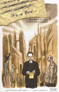
It's A Bird is an extremely unique comic written by Steven Seagle and illustrated by Teddy Kristiansen. The story revolves around Steve, a comic book writer who has just been offered Superman for his next project. The comic is an original take on autobiography, as Steve comes to terms with both Huntington's Disease (which runs in his family), and his inability to related to superman. These two situations are inextricably tied together, as Steve learns to cope with Huntington's as he also begins to understand Superman. I absolutely loved this comic. The art style, writing and overall concept were beautiful. All the subjects Seagle touches upon are very complex, yet speak so deeply and truly to the reader. Though the comic book is not very well, it took me awhile to read it, as I found myself taking time to really understand each page. Though Superman has a fascinating history and is the longest running superhero title, he's not a very popular hero in today's comic world (at least I don't think). The superman movies have never been as popular as other characters, and people tend to flock more towards the Batman comic stories. My friend once described Superman as being "really dull." For some reason, I was never much of a fan of Superman either, yet he is deeply tied into our culture. Seagle explores the different aspects of the Superman myth in an extremely honest and interesting way. I really enjoyed that Steven's story was interspersed with his various musings on Superman, which in turn were related to his feelings on Huntington's. Each Superman story which he wrote addressed a variety of topics.
The cover shows Steve walking though the streets of a strange looking city. Everyone around him bears the Superman logo. He holds a notebad and pen and is writing. The surrounding figures are drawn in a different style and are a bit less colored. Their faces are emotionless. The cover seems to express how the protagonist feels; alienated from soceity. A piece of ripped notebook paper lies in the top left corner, three lines are crossed out and only one remains - It's a Bird. The title is derived from one of the many classic sayings used in conjunction with Superman: "It's a bird, it's a plane, no, it's Superman!!!!"
Teddy Kristiansen's artwork parallels the complex and interesting storyline. He won an Eisner for his work on It's A Bird, and it's no wonder! I noticed that throughout the story there was an extensive use of red. I thought this was interesting to compare to the story about the colors of Superman's uniform, one of which is red. Most of the other colors were subdued, but red is a prevailing color. His style is also very unique, as most of it is painted. The style of the art also changed with the different stories, and varied from extremely abstract (like in "The Costume") to very detailed (like in "Leaving Krypton"). He also creates very interesting panels.
It's hard for me to pick a favorite section, as I loved all the superman stories. My favorites would have to be his analyzation of the letter S, his analyzation of color, and "The Outsider." The first two reminded me of things we learned how to do in Scott McCloud's books (ha!), and the other really showcased the contradictions between Superman and the normal citizens he tries to live among. His perfection and invulnerability leave people completely unable to relate to him. There were so many meanings to each story because of the ways in which they paralleled Steve's real life story.
I'm curious as to what stories Steve came up with in the end...
Tuesday, October 28, 2008
Persepolis: The Story of a Childhood
Persepolis is a autobiographical graphic novel written and illustrated by Marjane Satrapi. Satrapi grew up in Iran and witnessed both the Iranian Revolution and fall of the Shah. The novel is a collection of short stories about her childhood. I read Persepolis a long time ago, before I saw the movie (which I recommend!), and re-reading it I found that there was even more within her stories to discover. The novel is named after the ceremonial capital of the Persian empire that existed from 558-330BC. Persepolis is now a world heritage site and contains many fascinating ruins. The ancient Persian empire encompassed modern day Iran and was once the largest empire in the ancient world. Satrapi's choice of title carries many underlying meanings. The biography is especially powerful because it illustrates how she viewed her world as a child, and how she reacted to all the extreme events taking place. I think the fact that it was a series of stories rather than one long story allowed Satrapi to convey her message and feelings in a more complete way.
I adore the style of Persepolis. Satrapi did the whole novel in black and white, and uses negative space to create characters and shapes much of the time. Her use of black and white and relatively simple shapes and characters really add to the overall feel of the story. I found that her art reminded me of the murals found at many ancient persian sites, and the way she styles some of her panels (especially those in which she has many of the same soldier or corpse over and over) seemed to parallel ancient artwork. Another thing to note is the cover of the volume. It is very colorful except for the character represent herself, who sits vieled and staring, drawn in black and white. Both the entire cover and the drawing of her are surrounded by an ornate frame. The text is cracked and wavy, reminding one of the walls of ruins or pillars.
The relationship between Marjane and her grandmother was especially interesting. Her grandmother seems to have been extremely important to her whole family, and provided a sort of moral backbone and support. The few details about her grandmother's life were fascinating, and I would like to learn more. Marjane Satrapi wrote another graphic novel, entitled Embroideries, in which her grandmother is the main character. Besiders Marjane herself, I found her uncle Anoosh to be very interesting. He seems to have had a profound impact on her life, even after his execution. Their story was one of my favorites to read, as well as the one describing the homecoming of the released political prisoners. Both were fascinating, and at times humorous despite the circumstances the characters were living in.
I'll have to buy the next volume, and I think I'll rent the movie again!
Sunday, October 19, 2008
Death Note: The Last Name
Death Note: The Last Name, is the second and final part of the Death Note films. I was very lucky to actually see this in a theater! Nothing like seeing it on the big screen. I was very curious about what this movie would be like because of all the material it had to cover. The Death Note manga is multiple volumes, and to wrap it all up in one movie could not have been an easy task for the writers. I enjoy the film (though I felt the plot got extremely twisted at times) and found it very well done, but it ended up being quite different from the manga. Though I am not a Death Note "purist" it was interesting to note all the differences between the two.
I went with a classmate of mine to see Death Note, and was glad to have the company. Unfortunately I arrived a few minutes late and missed out on seeing some kids who came in costume! We were both hoping that the movie would be subtitled, as neither of us are big fans of dubbing. I think that the translation done for dubbing is often not as close to the original as the subtitle, and usually the voices just seem WAY too awkward and cheesy when matched with the actor. Unfortunately the showed the dubbed version but it was easy to get past the english voices/japanese actors after awhile. Death Note is very psychologically and morally complex, and I think the movie did a good job of portraying it. For most of the time that I was watching, I was very anxious! Since they changed so much from the manga, even I did not know what was going to happen, haha. There was one important event that was very different from the manga - Light actually succeeds in killing L! In the manga he tricks Rem into killing both Watari and L. Another guy then becomes L's replacement. It makes sense that they would change this in the movie, as it is a bit much to have an entirely new L halfway through the film. The rest of the events proceeded as they did in the manga (though with the different L). Though the movie ended in a lighter tone than the manga, the death of Light was dark as it was in the manga, and the actor who played Light did an excellent job of portraying him during his death scene. I read in an interview that the two actors who played Light and L got so into their characters that they barely even spoke with each other when the camera wasn't rolling! I'd like to see the L spin-off next, because his character is fascinating. I'm a lover of sweet but seeing him constantly eating candy dipped in sugar and syrup made me a bit queasy...
I think the film definitely had a message about justice and the law that was similar to that of the manga, despite the changes. I would definitely recommend seeing this film to anyone who is a fan of the manga or anime, or even enjoys a good j-movie!
Tuesday, October 14, 2008
Astro City...Continued
I just finished reading Astro City: Life in the Big City and let me tell you, I want more! Something tells me I will be heading to St Marks Comics as soon as tomorrow to buy the next volume...
I think what has me so hooked on this comic book is the character development. Action isn't much of the focus in these first few stories, but rather the people who are affected by it and the superheroes who are taking part.
While I very much enjoyed each of the stories, my favorites would have to be two that do not really focus on the superheroes themselves - "The Scoop" and "Safeguards." Like Busiek mentioned in his introduction, it is a completely different approach to explore the ways in which normal people who live in this "superhero world" are affected. That idea is not something that I had ever really thought of before, but it makes sense that people living amongst super human beings would have a different mentality than those who do not. This is apparent in the way Marta looks up in awe at Winged Victory and is fascinated by the humanity of Nick Furst. What I also enjoyed about this story was the juxtaposition of the seemingly "old world" type magic and creatures of Marta's Shadow Hill neighborhood vs. the "steel and glass," superheroes and villians of downtown Astro City. I'm still trying to figure out what exactly it was that changed for Marta and convinced her to stay in Shadow Hill. I found the story very complex and believable, because the outcome wasn't necessarily what I expected.
The ending of "Scoop" was what really made me smile. I think it was my favorite story of the whole volume because its amusing way of expressing the importance of truth, especially in reporting. The whole story I was so anxious to see what the article was going to end up being about! It was a interesting angle to approach the story from, and I found myself wishing I was sitting in that office listening to the story from Mister Mills himself. What a great character! Even in Astro City, where it's obvious that superheroes exist, it is still important that the news does not become sensationalized. Even in the presence of the supernatural, it is still important to get the cold hard facts before publishing a story. I think that this story spoke to more than just the Astro City enws...
Of the superheroes of Astro City, Samaritan interests me the most. I was glad to find out his back story when he explains it to Winged Victory, as it added a new element to his character. The conversation between Winged Victory and Samaritan (or rather, their alter egos) was my favorite part of that whole story, because it showed these two superheroes having a very real debate about the motives behind their actions. It showed that superheroes are still capable of having doubts, just like the other Astro City citizens.
Comic Book Confidential
Comic Book Confidential is a documentary by Ron Mann, released in 1988. I had been itching to see this for a long time, and finally got the chance this weekend. Having seen another one of Mann's documentaries, Grass, I was looking forward to seeing how he approached this topic. The history of the comic book and its contributions to pop culture and a variety of mediums is long and complex, and certainly could not be covered in one film alone. That being said, I thought Mann did an incredible job of capturing integral moments in the history of the comic book and exploring the various movements within the medium. The style in which he did so was also very original. One of my favorite things Mann did was pan over comic strips and add sound effects as each artist/writer read their own work. He added another dimension to the strips by doing so, and brought what you usually only imagine into reality.
And what a goldmine of interviews! Everyone from Stan Lee to Bill Griffith spoke, and I hung on their every word. Their interviews really spoke to the ways in which comic books reflect the social mentalities of their time. I always enjoy seeing the faces and hearing the voices behind a comic book, but to listen to them read their own work was beyond words! There is something fascinating about listening to a writer read their work in the way they imagine it. I like to then compare it to the way I imagined their characters sounding! R Crumb was my favorite to see interviewed.
All the original footage also added a lot to the documentary. It's fun to see all the underground comic book artists at work, as well as see footage of the hearings on the dangers of comic books. The arguments being made seem almost humorous (yet believable) now, but I can see how they would have been detrimental and suffocating to the industry.
I would definitely recommend this documentary to any one interested in learning more about the complex world of the comic book!
Subscribe to:
Posts (Atom)