 It's A Bird is an extremely unique comic written by Steven Seagle and illustrated by Teddy Kristiansen. The story revolves around Steve, a comic book writer who has just been offered Superman for his next project. The comic is an original take on autobiography, as Steve comes to terms with both Huntington's Disease (which runs in his family), and his inability to related to superman. These two situations are inextricably tied together, as Steve learns to cope with Huntington's as he also begins to understand Superman. I absolutely loved this comic. The art style, writing and overall concept were beautiful. All the subjects Seagle touches upon are very complex, yet speak so deeply and truly to the reader. Though the comic book is not very well, it took me awhile to read it, as I found myself taking time to really understand each page. Though Superman has a fascinating history and is the longest running superhero title, he's not a very popular hero in today's comic world (at least I don't think). The superman movies have never been as popular as other characters, and people tend to flock more towards the Batman comic stories. My friend once described Superman as being "really dull." For some reason, I was never much of a fan of Superman either, yet he is deeply tied into our culture. Seagle explores the different aspects of the Superman myth in an extremely honest and interesting way. I really enjoyed that Steven's story was interspersed with his various musings on Superman, which in turn were related to his feelings on Huntington's. Each Superman story which he wrote addressed a variety of topics.
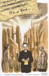
The cover shows Steve walking though the streets of a strange looking city. Everyone around him bears the Superman logo. He holds a notebad and pen and is writing. The surrounding figures are drawn in a different style and are a bit less colored. Their faces are emotionless. The cover seems to express how the protagonist feels; alienated from soceity. A piece of ripped notebook paper lies in the top left corner, three lines are crossed out and only one remains - It's a Bird. The title is derived from one of the many classic sayings used in conjunction with Superman: "It's a bird, it's a plane, no, it's Superman!!!!"
Teddy Kristiansen's artwork parallels the complex and interesting storyline. He won an Eisner for his work on It's A Bird, and it's no wonder! I noticed that throughout the story there was an extensive use of red. I thought this was interesting to compare to the story about the colors of Superman's uniform, one of which is red. Most of the other colors were subdued, but red is a prevailing color. His style is also very unique, as most of it is painted. The style of the art also changed with the different stories, and varied from extremely abstract (like in "The Costume") to very detailed (like in "Leaving Krypton"). He also creates very interesting panels.
It's hard for me to pick a favorite section, as I loved all the superman stories. My favorites would have to be his analyzation of the letter S, his analyzation of color, and "The Outsider." The first two reminded me of things we learned how to do in Scott McCloud's books (ha!), and the other really showcased the contradictions between Superman and the normal citizens he tries to live among. His perfection and invulnerability leave people completely unable to relate to him. There were so many meanings to each story because of the ways in which they paralleled Steve's real life story.
I'm curious as to what stories Steve came up with in the end...

No comments:
Post a Comment